Data Visualization Best Practices for Fintech Dashboards
Mastering the art of high-stakes financial intelligence through superior design.

Visual Clarity: The Pulse of Finance
For financial institutions, every millisecond and every pixel counts. Visual clarity isn't just an aesthetic choice; it serves as a critical defense against cognitive overload. In an industry where market volatility is the norm, dashboards must translate high-velocity data into actionable insights instantly. Lack of clarity can lead to missed opportunities or, worse, critical oversights in risk management.
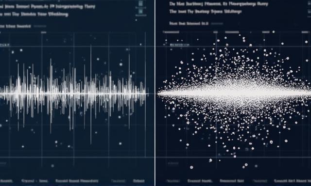
Tip 1: High-Velocity Data Structures
In Fintech, traditional charts often fail. Sparklines are significantly more effective for representing historical trends within a compact space compared to bulky pie charts. They provide context without sacrificing screen real estate, which is vital for monitoring constant market fluctuations.
Tip 2: Semantic Color Usage
Color should communicate state, not just aesthetics. We recommend a strict color protocol: use muted tones for categorical differentiation and high-contrast, semantic colors (like Emerald-to-Crimson) exclusively for indicating status change or performance variance. This ensures that a user's attention is immediately drawn to what matters most.
Tip 3: Secure & Deep Drill-Downs
Fintech dashboards must balance the "Big Picture" with granular data availability. Designing for drill-down functionality requires a "Progressive Disclosure" approach: show only what's necessary, but allow users to dive deep into transaction logs or client histories with a single click—all while maintaining strict RBAC (Role-Based Access Control) visibility.